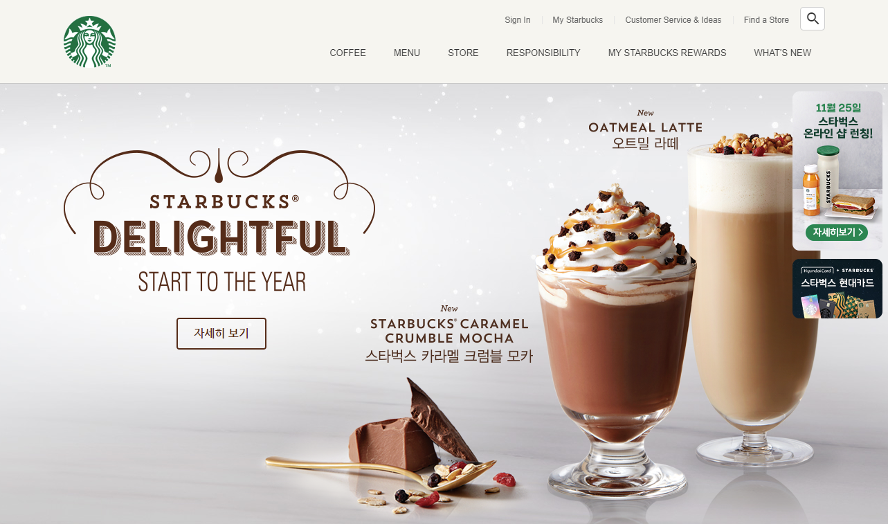
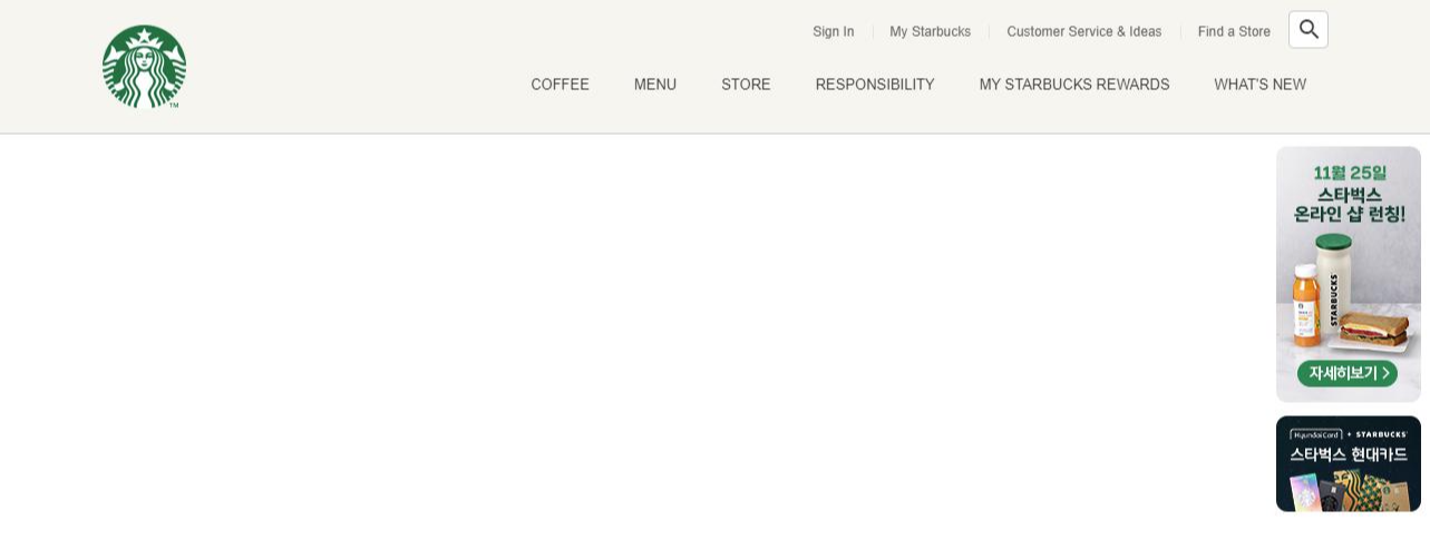
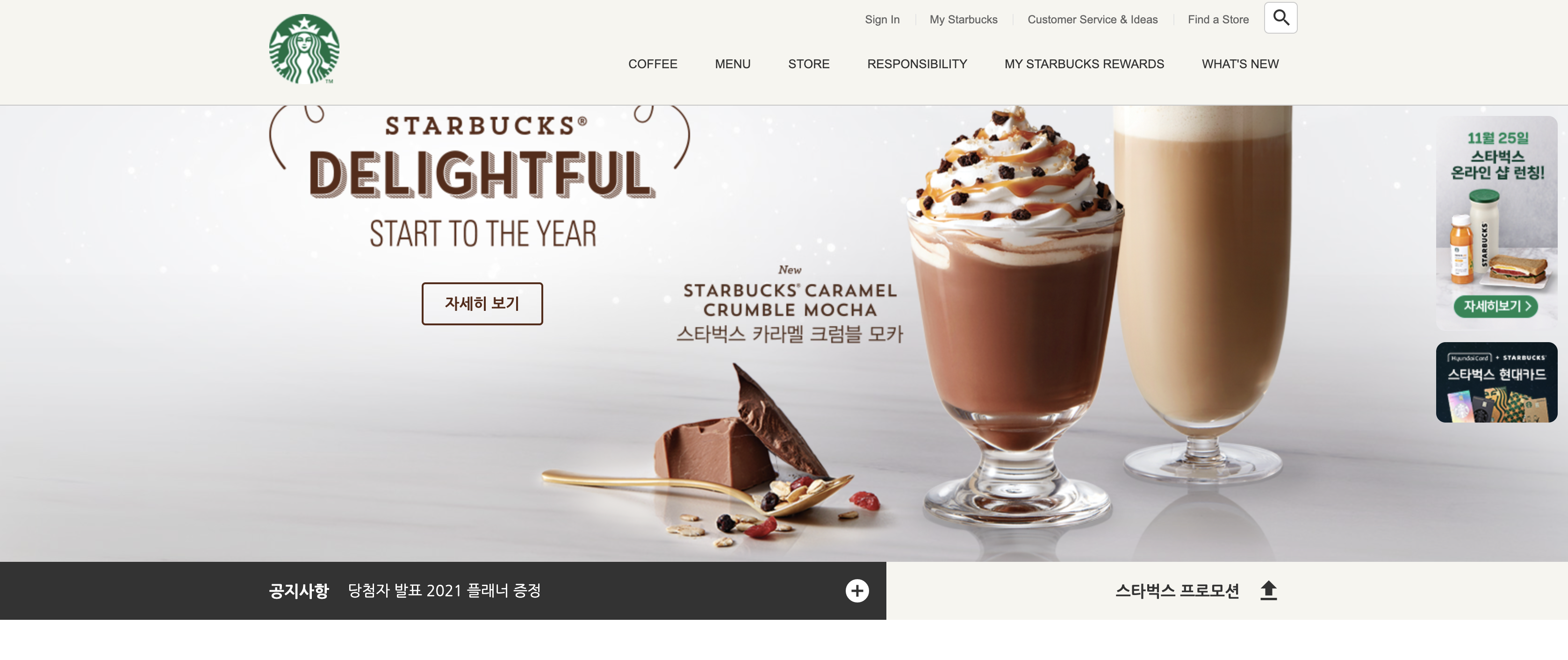
728x90
728x90

1. 화면분할

- height 62px

- left 60% / 배경 #333

- right 40%/ 배경 #f6f5ef

- h2 / size 17px / weight 700 / margin-right 20px

- 아이콘 사이즈 30px


2. swiper로 공지사항 리스트 만들기


1. 화면 분할

(힌트)

더보기
더보기

section안에

1) notice-line 자식 요소로 bg-left, bg-right, inner 생성

2) inner 자식요소로 inner__left, inner_right 생성


<section class="notice">

  <div class="notice-line">
    <div class="bg-left"></div>
    <div class="bg-right"></div>
    <div class="inner">

      <div class="inner__left">
        <h2>공지사항</h2>
        <div class="swiper-container"></div>
        <a href="javascript:void(0)" class="notice-line__more">
          <div class="material-icons">add_circle</div>
        </a>
      </div>
      
      <div class="inner__right">
        <h2>스타벅스 프로모션</h2>
        <div class="toggle-promotion">
          <div class="material-icons">upload</div>
        </div>
      </div>

    </div>
  </div>

 </section>
.notice .notice-line {
  position: relative;
}

.notice .notice-line .bg-left {
  position: absolute;
  top: 0;
  left: 0;
  width: 50%;
  height: 100%;
  background-color: #333;
}

.notice .notice-line .bg-right {
  position: absolute;
  top: 0;
  right: 0;
  width: 50%;
  height: 100%;
  background-color: #f6f5ef;
}

.notice .notice-line .inner {
  height: 62px;/*부모에 높이값이 없고, 기본값이 세로로 줄어들려고 하기때문에 */
  display: flex;
}

.notice .notice-line .inner__left {
  width: 60%;
  height: 100%;
  background-color: #333;
  display: flex;
  align-items: center;
}

.notice .notice-line .inner__left h2 {
  color: #fff;
  font-size: 17px;
  font-weight: 700;
  margin-right: 20px;
}

.notice .notice-line .inner__left .swiper-container { /*중요*/
  height: 62px;
  flex-grow: 1;
}

.notice .notice-line .inner__left .swiper-slide { 
  height: 62px;
  display: flex;
  align-items: center;
}

.notice .notice-line .inner__left .swiper-slide a { 
  color: #fff;
}

.notice .notice-line .inner__left .notice-line__more {
  width: 62px;
  height: 62px;
  display: flex;
  justify-content: center;
  align-items: center;
}

.notice .notice-line .inner__left .notice-line__more .material-icons {
  color: #fff;
  font-size: 30px;
}

.notice .notice-line .inner__right {
  width: 40%;
  height: 100%;
  display: flex;
  justify-content: flex-end;
  align-items: center;
}

.notice .notice-line .inner__right h2 {
  font-size: 17px;
  font-weight: 700;
}

.notice .notice-line .inner__right .toggle-promotion {
  width: 62px;
  height: 62px;
  cursor: pointer;
  display: flex;
  justify-content: center;
  align-items: center;
}

.notice .notice-line .inner__right .toggle-promotion .material-icons {
  font-size: 30px;
}


2. swiper사용해 수직으로 올라가는 공지사항 리스트 만들기 

(힌트)

더보기
더보기

1) swiperjs사이트에서 css, js링크 함께 연결

2) js에서 direction, autoplay, loop 속성 부여

*사이트의 demo에서 다양한 예제 확인 가능


Swiper - The Most Modern Mobile Touch Slider

Swiper is the most modern free mobile touch slider with hardware accelerated transitions and amazing native behavior.

swiperjs.com

<div class="inner__left">
  <h2>공지사항</h2>
  <div class="swiper-container">
  	<div class="swiper-wrapper">
      <div class="swiper-slide">
          <a href="javascript:void(0)">연말연시 영업시간</a>
      </div>
      <div class="swiper-slide">
          <a href="javascript:void(0)">크리스마스 기간 이벤트 안내</a>
      </div>
      <div class="swiper-slide">
          <a href="javascript:void(0)">당첨자 발표 2021 플래너 증정</a>
      </div>
      <div class="swiper-slide">
          <a href="javascript:void(0)">어플리케이션 버전 업데이트 안내</a>
      </div>
    </div>
  </div>
  <a href="javascript:void(0)" class="notice-line__more">
  	<div class="material-icons">add_circle</div>
  </a>
</div>
// swiper
// new Swiper(선택자, 옵션)

new Swiper('.notice-line .swiper-container', {
  direction: 'vertical',
  autoplay: true,
  loop: true
});
728x90
728x90

1. visual section 배경 넣고 이미지 배치하기

- height 646px


2. 시간차로 이미지 나타내기

- 클래스 fade-in 추가하여 투명도가 0인 상태에서 시작


3. 5가지 버튼 만들기 (#333,reverse,#592B18,#D9AA8A,#fff)

- width 139px / padding 10px


1. visual section 배경 넣고 이미지 배치하기

<!-- VISUAL SECTION -->
 <section class="visual">
  <div class="inner">

    <div class="title">
      <img src="./images/visual_title.png" alt="Delightful" />
      <a href="javascript:void(0)" class="btn btn--brown">자세히 보기</a>
    </div>
    <img src="./images/visual_cup1.png" alt="new OATMEAL LATTE" class="cup1 image" />
    <img src="./images/visual_cup1_text.png" alt="오트밀 라떼" class="cup1 text" />
    <img src="./images/visual_cup2.png" alt="new CARAMEL CRUMBLE MOCHA" class="cup2 image" />
    <img src="./images/visual_cup2_text.png" alt="카라멜 크럼블 모카" class="cup2 text" />
    <img src="./images/visual_spoon.png" alt="spoon" class="spoon" />

  </div>
 </section>
.visual {  margin-top: 120px;  background-image: url("../images/visual_bg.jpg");  background-position: center;}
.visual .inner {  height: 646px;}
.visual .title {  position: absolute;  top: 88px;  left: -10px;}
.visual .title .btn {  position: absolute;  top: 259px;  left: 173px;}
.visual .cup1.image {  position: absolute;  bottom: 0;  right: -47px;}
.visual .cup1.text {  position: absolute;  top: 38px;  right: 171px;}
.visual .cup2.image {  position: absolute;  bottom: 0px;  right: 162px;}
.visual .cup2.text {  position: absolute;  top: 321px;  right: 416px;}
.visual .spoon {  position: absolute;  bottom: 0px;  left: 275px;}


2. 시간차로 이미지 나타내기

(힌트)

더보기

- CSS에서 .fade-in에는 모두 투명도0

- JS에서 forEach라는 DOM API와 gsap 라이브러리를 이용

- forEach함수의 매개변수로는 fadeEl, index 이용

- gsap의 속성은 delay와 opacity 이용

📌반복처리하는 함수 forEach

📌index는 0부터 시작하는 제로베이스 -> index + 1

📌.7초마다 나타나게 하기 위해서는 기초값에 .7을 곱한다.

const fadeEls = document.querySelectorAll('.visual .fade-in');

fadeEls.forEach(function (fadeEl, index) {
  gsap.to(fadeEl, 1, { //fadeEl은 1초 동안 {}하게 한다.
    delay: (index + 1) * .7, //fadeEl은 각각 .7초 차이로 나타난다.
    opacity: 1
  });
});
.visual .fade-in {
  opacity: 0;
}
<div class="title fade-in">
  <img src="./images/visual_title.png" alt="Delightful" />
  <a href="javascript:void(0)" class="btn btn--brown">자세히 보기</a>
</div>
<div class="fade-in">
  <img src="./images/visual_cup1.png" alt="new OATMEAL LATTE" class="cup1 image" />
  <img src="./images/visual_cup1_text.png" alt="오트밀 라떼" class="cup1 text" />
</div>
<div class="fade-in">
  <img src="./images/visual_cup2.png" alt="new CARAMEL CRUMBLE MOCHA" class="cup2 image" />
  <img src="./images/visual_cup2_text.png" alt="카라멜 크럼블 모카" class="cup2 text" />
</div>
  <div class="fade-in">
  <img src="./images/visual_spoon.png" alt="spoon" class="spoon" />
</div>


3. 5가지 버튼 만들기

📌 -- dash기호를 사용한 클래스명 부여

.btn {
  width: 130px;
  padding: 10px;
  border: 2px solid #333;
  border-radius: 4px;
  color: #333;
  font-size: 16px; /* 부모로부터 글씨의 영향을 받을 수 있으므로 지정 */
  font-weight: 700;
  text-align: center;
  cursor: pointer;
  box-sizing: border-box;
  display: block; /* a, span태그에 버튼을 부여했을 때도 정상적으로 작동하도록 */
  transition: .4s;
}
.btn:hover {  background-color: #333;  color: #fff;}

.btn.btn--reverse {  background-color: #333;  color: #fff;}
.btn.btn--reverse:hover {  background-color: transparent;  color: #333;}

.btn.btn--brown {  border-color: #592B18;  color: #592B18;}
.btn.btn--brown:hover {  background-color: #592B18;  color: #fff;}

.btn.btn--gold {  border-color: #D9AA8A;  color: #D9AA8A;}
.btn.btn--gold:hover {  background-color: #D9AA8A;  color: #fff;}

.btn.btn--white {  border-color: #fff;  color: #fff;}
.btn.btn--white:hover {  background-color: #fff;  color: #333;}


728x90
728x90

1. 메인메뉴 상단 고정


2. HEADER 밑 우측에 라운드 배지 고정

- top 132px / right 12px

- 라운드 10px / 아래 마진 12px


3. 아래로 스크롤하면 사라지는 배지


1. 메인메뉴 상단 고정

📌position이 relative에서 fixed나 absolute로 변경될 때 width값은 최소너비를 유지하려고 한다. 

header {
  width: 100%;
  position: fixed;
  top: 0;
}


2. 배지 고정

<div class="badges">
  <div class="badge">
  	<img src="./images/badge1.jpg" alt="badge1">
  </div>
  <div class="badge">
  	<img src="./images/badge2.jpg" alt="badge2">
  </div>
</div>
header .badges {
  position: absolute;
  top: 132px;
  right: 12px;
}

header .badges .badge {
  border-radius: 10px;
  overflow: hidden;
  margin-bottom: 12px;
  cursor: pointer;
}


3. 스크롤하면 배지 사라지기

3-1. 적당한 스크롤 횟수 부여하기

      ㄴ 스크롤이 지나치게 자주 발생하는 것을 조절 (throttle, 일부러 부하를 줌)

(힌트)

더보기

윈도우(뷰포트)에 scroll이벤트를 추가하여  _.throttle(함수, 시간) 라이브러리를 이용해 적당한 스크롤 횟수(0.3초) 조정


lodash.js - Libraries - cdnjs - The #1 free and open source CDN built to make life easier for developers

A utility library delivering consistency, customization, performance, & extras. - Simple. Fast. Reliable. Content delivery at its finest. cdnjs is a free and open-source CDN service trusted by over 12.5% of all websites, serving over 200 billion requests e

cdnjs.com

window.addEventListener('scroll', _.throttle(function () {
  console.log('scroll!');
}, 300));


3-1. 애니메이션 처리 라이브러리로 자연스럽게 사라지고 나타나기

(힌트)

더보기

애니메이션 처리을 처리하는 gsap라이브러리를 이용, 스크롤 500이 넘어가면 자연스럽게 사라졌다가 나타나기

gsap.to(요소, 지속시간, 옵션);


*옵션은 객체 데이터로 사용, 여기서는 조건문을 이용한다.

*opacity는 시각적으로만 사라진 상태이므로 존재하지 않는 상태(혹은 존재하는 상태)의 속성을 추가할 것


gsap - Libraries - cdnjs - The #1 free and open source CDN built to make life easier for developers

GSAP is a JavaScript library for building high-performance animations that work in **every** major browser. Animate CSS, SVG, canvas, React, Vue, WebGL, colors, strings, motion paths, generic objects...anything JavaScript can touch! No other library delive

cdnjs.com

const badgeEl = document.querySelector('header .badges')

window.addEventListener('scroll', _.throttle(function () {
  console.log(window.scrollY);
  if (window.scrollY > 500) {
  	// 사라지기
    gsap.to(badgeEl, .6, {
      opacity: 0,
      display: 'none'
    });
  } else {
  	// 나타내기
    gsap.to(badgeEl, .6, {
      opacity: 1,
      display: 'block'
    });
  }
}, 300));


728x90
728x90

1. 메인메뉴 구조

- item__name : padding 10 20 34 20 / size 13px / Arial, sans-serif

- item hover : color #669900 / 배경 #2c2a29 / 상단좌우 보더 6px


2. 드롭다운 2줄 만들기

- contents__menu : 배경 #2c2a29 / 너비 220px / padding 20px 0

- contents__menu 제목 : padding 3px 0 12px 0 / #fff / size 14px

- contents__menu 리스트 : padding 5px 0 / #999(hover #669900) / size 12px / 마우스 포인터

- contents__texture :  padding 26px 0 / size 12px

- contents__texture h4 : #999 / 두께 700

- contents__texture p : #669900 / margin 4px 0 14px


1. 메인메뉴 구조 "depth메뉴"

헷갈리는 ul안에 ul안에 ul 도식화 정리


📍 class명 설명

item__name : 메뉴 카테고리명

item__contents : 하위 내용

  ㄴcontents__menu : 여러 개의 메뉴판 리스트 (가로 ul 안에 또 세로 ul)

  ㄴcontents__texture


📍 2deph 도식화


2. 드롭다운 만들기 

2-1. 드롭다운 item__name과 item__contents 배치하기 📌

2-2. 메뉴를 hover할 때만 하위 메뉴가 나오도록 display를 none/block으로 지정 📌

(설명)

더보기

item__name의 위치는 main-menu의 위치에 따라 정해진다.

main-menu는 header안에 있으므로 absolute position으로 right, bottom을 이용한다.


item__contents를 뷰포트 기준으로 너비를 설정하고 위치를 고정시킨다.

이때 top, bottom등 다른 위치는 사용하지 않고 left 속성만 사용하여 fixed한다.

header .main-menu {
  position: absolute;
  bottom: 0;
  right: 0;
  z-index: 1;
  display: flex;
}
header .main-menu .item .item__name {
  padding: 10px 20px 34px 20px;
  font-family: Arial, sans-serif;
  font-size: 13px;
}
header .main-menu .item:hover .item__name {
  background-color: #2C2A29;
  color: #669900;
  border-radius: 6px 6px 0 0;
}
header .main-menu .item .item__contents {
  width: 100%;
  position: fixed;
  left: 0;
  display: none; /*평소에는 보이지 않게*/
}
header .main-menu .item:hover .item__contents {
  display: block; /*hover하면 보이게*/
}


728x90
728x90

1. 로고

- 높이 75px


2. 서브메뉴

- 기본 : 12px / #656565 / padding 11 16 / 폰트 Arial

- hover : #000

- 가상 선택자로 구분선 만들기 : #e5e5e5 / 높이12px


3. 검색창

- 기본 : 36x34px / padding 4 10 / 선 #ccc / 선 파란색 없애기 / 폰트 12px / 돋보기 24px

- focus : 가로 190px / 선 #669900 / 너비만 0.4초로 늘어나기 / "통합검색" / 돋보기 아이콘 사라지기

- blur : "통합검색" 사라지기, 돋보기 아이콘 생기기

+ 돋보기 아이콘을 클릭해도 input창이 넓어지게 만들기 


4 header

- 배경 #f6f5f0, 밑줄 #c8c8c8

- inner 가로사이즈 1100px


1. 가운데 정렬, 로고 위치

📌margin으로 정렬하려면 height 혹은 width가 우선되어야 함

<a href="/" class="logo">
  <img src="./images/starbucks_logo.png" alt="logo" />
</a>
header .logo {
  height: 75px;
  position: absolute;
  top: 0;
  bottom: 0;
  left: 0;
  margin: auto;
}


2. 서브메뉴

📌서브메뉴의 크기와 폰트는 <a>태그에서

    ㄴ <a>태그는 inline이므로 display를 block으로 변경

    ㄴ <a>태그의 padding으로 서브메뉴의 크기를 지정

    ㄴ font-size, color도 <a>태그에서 지정해주어야 링크색(파란색)을 제거할 수 있음


📌가상 선택자로 li앞에 구분선 만들기 

    ㄴ 가상 선택자 before는 항상 content속성을 가짐

    ㄴ 구분선은 width, height, background-color으로 보여짐

    ㄴ 구분선의 위치는 position과 margin으로 지정


📌검색창

    ㄴ <input>태그에서 box-sizing에 유념

    ㄴ 돋보기 아이콘은 position으로 위치 지정

더보기

<div class="inner">

      <a href="/" class="logo">

        <img src="./images/starbucks_logo.png" alt="STARBUCKS" />

      </a>

      <div class="sub-menu">

        <ul class="menu">

          <li>

            <a href="/signin">Sign In</a>

          </li>

          <li>

            <a href="javascript:void(0)">My Starbucks</a>

          </li>

          <li>

            <a href="javascript:void(0)">Customer Service & Ideas</a>

          </li>

          <li>

            <a href="javascript:void(0)">Find a Store</a>

          </li>

        </ul>

        <div class="search">

          <input type="text" />

          <span class="material-icons">search</span>

        </div>

      </div>

</div>

header .sub-menu {
  position: absolute;
  top: 10px;
  right: 0;
  display: flex;
}
header .sub-menu ul.menu {
  font-family: Arial, sans-serif;
  display: flex;
}
header .sub-menu ul.menu li {
  position: relative;
}
header .sub-menu ul.menu li::before {
  content: "";
  /* display: block; */
  width: 1px;
  height: 12px;
  background-color: #e5e5e5;
  position: absolute;
  top: 0;
  bottom: 0;
  margin: auto;
}
header .sub-menu ul.menu li:first-child::before {
  display: none;
}
header .sub-menu .search {
  position: relative;
  height: 34px;
}
header .sub-menu .search input {
  width: 36px;
  height: inherit;
  padding: 4px 10px;
  border: 1px solid #ccc;
  box-sizing: border-box;
  border-radius: 5px;
  outline: none;
  background-color: #fff;
  color: #777;
  font-size: 12px;
  transition: width .4s;
}
header .sub-menu .search input:focus {
  width: 190px;
  border-color: #669900;
}
header .sub-menu .search .material-icons {
  height: 24px;
  position: absolute;
  top: 0;
  bottom: 0;
  right: 5px;
  margin: auto;
  transition: .4s;
}


3. 아이콘이미지를 눌러도 input 너비 넓어지게 만들기

📌querySelector는 클래스명, 태그명을 모두 찾아주는 DOM API로 클래스를 쓸 때는 반드시 온점(.)을 추가해야 한다.

(힌트)

더보기

클래스선택자search와 input태그를 이용하여 클릭이벤트가 발생했을 때 input태그에 focus하시오.

const searchEl = document.querySelector('.search');
const searchInputEl = searchEl.querySelector('input');

searchEl.addEventListener('click', function () {
  searchInputEl.focus();
});


4. Input focus / blur 됐을 때 : 통합검색, 아이콘 변경

- 검색창에 "통합검색" 추가, 돋보기 아이콘 사라지기

- 검색창에 "통합검색" 삭제, 돋보기 아이콘 나타나기

4-1. Input태그에 focus됐을 때 클래스선택자search에 focused 클래스를 추가하시오

4-2. Input태그에 focus됐을 때 input태그에 placeholder='통합검색' 속성을 추가하시오

4-3. Input태그에 blur됐을 때 클래스선택자search에 focused 클래스를 제거하시오

4-4. Input태그에 blur됐을 때 input태그에 placeholder='' 속성을 추가하시오

4-5. 돋보기 아이콘를 투명도 0으로 0.4초 트랜지션 하시오 

(힌트)

더보기

addEventListener, focus, blur, classList, add, remove, setAttribute

searchInputEl.addEventListener('focus', function () {
  searchEl.classList.add('focused');
  searchInputEl.setAttribute('placeholder', '통합검색');
});

searchInputEl.addEventListener('blur', function () {
  searchEl.classList.remove('focused');
  searchInputEl.setAttribute('placeholder', '');
});
728x90
+ Recent posts
728x90