728x90
728x90


1. 앞, 뒷면 만들기

 <!-- RESERVE STORE -->
 <section class="reserve-store">

  <div class="inner">
  
    <div class="medal">
    
      <div class="front">
        <img src="./images/reserve_store_medal_front.png" alt="" />
      </div>
      
      <div class="back">
        <img src="./images/reserve_store_medal_back.png" alt="" />
        <a href="javascript:void(0)" class="btn btn--gold">자세히 보기</a>
      </div>
      
    </div>
    
  </div>

 </section>


2. 회전시켰을 때 뒷면 안 보이기

(힌트)

더보기

perspective / backface-visibility / transform: rotateY( )

🚨 3D 애니메이션

📍부모 요소에 perspective를 주고 

📍자식 요소에 transition, backface-visibilty: hidden, transform: rotateY를 줄 수 있다.

📍transform 방향

 ㄴ transform: rotateY(0)은 원래 상태다.

 ㄴ transform: rotateY(180/-180)은 뒤집어진 상태다.

📍자식요소들을 position: absolute하여 이미지 위치를 겹치는 상태로 만들 것

/* 3D */
.reserve-store {
  background-image: url("../images/reserve_store_bg.jpg");
  background-attachment: fixed;
  background-position: center;
  background-repeat: no-repeat;
  background-size: cover;
}

.reserve-store .inner {
  height: 600px;
  display: flex;
  justify-content: center;
  align-items: center;
}

.reserve-store .medal {
  width: 334px;
  height: 334px;
  perspective: 600px;
}

.reserve-store .medal .front,
.reserve-store .medal .back {
  position: absolute;
  width: 334px;
  height: 334px;
  backface-visibility: hidden;
  transition: 1s;
}

.reserve-store .medal .front {
  /* position: absolute;  앞면과 뒷면을 동일한 곳에 위치시킬 때 */
  transform: rotateY(0deg);
}

.reserve-store .medal:hover .front {
  transform: rotateY(180deg);
}

.reserve-store .medal .back {
  transform: rotateY(-180deg);
}

.reserve-store .medal:hover .back {
  transform: rotateY(0deg);
}

.reserve-store .medal .btn {
  position: absolute;
  top: 210px;
  left: 0;
  right: 0;
  margin: auto;
}
728x90
728x90

1. reserve section

- height 400px 


2. pick your favorate section (배경 고정)

- text-group width 362px


1. reserve section

<!-- RESERVE -->
 <section class="reserve-coffee">
  <div class="inner">
    <img src="./images/reserve_logo.png" alt="" class="reserve-logo" />

    <div class="text-group">
      <img src="./images/reserve_text.png" alt="" class="description" />
      <div class="more">
        <a href="javascript:void(0)" class="btn btn--gold">자세히 보기</a>
      </div>
    </div>

    <img src="./images/reserve_image.png" alt="" class="product" />
  </div>
 </section>
/* RESEVE */
.reserve-coffee {
  background-image: url("../images/reserve_bg.jpg");
}

.reserve-coffee .inner {
  height: 400px;
}

.reserve-coffee .reserve-logo {
  position: absolute;
  top: 100px;
  left: 0;
}

.reserve-coffee .text-group {
  position: absolute;
  top: 100px;
  left: 200px;
}

.reserve-coffee .text-group .title {
  margin-bottom: 10px;
}

.reserve-coffee .text-group .description {
  margin-bottom: 10px;
}

.reserve-coffee .product {
  position: absolute;
  top: 0;
  right: 0;
}


2. pick your favorate section (배경 고정) 📌

<!-- PICK YOUR FAVORITE -->
 <section class="pick-your-favorite">
  <div class="inner">
    <div class="text-group">
      <img src="./images/favorite_text1.png" alt="" class="title">
      <img src="./images/favorite_text2.png" alt="" class="description">
      <div class="more">
        <a href="javascript:void(0)" class="btn btn--white">자세히 보기</a>
      </div>
    </div>
  </div>
 </section>
/* pick-your-favorite */
.pick-your-favorite {
  background-image: url("../images/favorite_bg.jpg");
  background-repeat: no-repeat;
  background-position: center;
  background-attachment: fixed;
  background-size: cover;
}

.pick-your-favorite .inner {
  padding: 110px 0;
}

.pick-your-favorite .text-group {
  width: 362px;
  display: flex;
  flex-wrap: wrap;
  justify-content: flex-end;
  margin-left: 100px;
}

.pick-your-favorite .text-group .title {
  margin-bottom: 40px;
}

.pick-your-favorite .text-group .description {
  margin-bottom: 40px;
}
728x90
728x90

💻 유튜브 영상 배경으로 깔기

💻 가상클래스 padding-top으로 영역 만들기

💻 Youtube iframe API 사용법

💻 애니메이션 반복 (플로팅 이미지 만들기)

💻 랜덤함수를 이용한 애니메이션 반복

🚨 padding-top으로 부모 요소의 가로 너비 50%만큼의 높이 갖기

📍 youtube나 vimeo영상을 16:9비율로 가져올 때 padding-top:56.25%로 한다. 

.container {width: 100px;}
.container .item {width: 100%;height: 0;padding-top: 50%;}


🚨 가상클래스로 youtube 영역 만들기

현재 부모 요소(.youtube__area) 안에 자식 요소가 없는 상태이므로

가상클래스before를 이용하여 자식을 만들어 유투브 영역을 만들어 준다. (스타일 작업을 위한 요소이므로)

가상클래스는 inline요소다.

.youtube {
  position: relative;
}
.youtube .youtube__area {
  width: 1920px;
  background-color: #333; /*색상을 지정해 현재 위치를 알 수 있음*/
  position: absolute;
  left: -50%;
  margin-left: calc(1920px / -2);
}
.youtube .youtube__area::before {
  content: "";
  display: block;
  width: 100%;
  height: 0;
  padding-top: 56.25%;
}


🚨 youtube 전체영역에 투명한 어두운 배경 덮기

ㄴ 패턴 배경 + 투명도 30%

ㄴ 너비와 높이가 있어야 함

.youtube .youtube__cover {
  background-image: url('../images/video_cover_pattern.png');
  background-color: rgba(0,0,0,0.3);
  position: absolute;
  top: 0;
  left: 0;
  width: 100%;
  height: 100%;
}


🚨 youtube iframe API

📍API JavaScript

(힌트)

더보기

1) 유튜브 영상이 출력될 위치에 요소를 생성

<!-- in HEAD --> <script defer src="./js/youtube.js"></script>

<!-- in BODY --> <div id="player"></div>


2) 객체데이터와 속성

videoId / playerVars(autoplay,loop,playlist) / events(onready 매개변수로 event)

- 내장플레이어


iframe 삽입에 대한 YouTube Player API 참조 문서  |  YouTube IFrame Player API

Embed a YouTube player in your application.

developers.google.com

- 매개변수


YouTube 내장 플레이어 및 플레이어 매개변수  |  YouTube IFrame Player API

YouTube 내장 플레이어 및 플레이어 매개변수 개요 이 문서에서는 애플리케이션에 YouTube 플레이어를 삽입하는 방법을 설명하고 YouTube 내장 플레이어에서 사용할 수 있는 매개변수를 정의합니다. I

developers.google.com

// 2. This code loads the IFrame Player API code asynchronously. --></script>
var tag = document.createElement('script');

tag.src = "https://www.youtube.com/iframe_api";
var firstScriptTag = document.getElementsByTagName('script')[0];
firstScriptTag.parentNode.insertBefore(tag, firstScriptTag);

// 3. This function creates an <iframe> (and YouTube player)
//    after the API code downloads.
function onYouTubeIframeAPIReady() {
// <div id="player"></div>
new YT.Player('player', {
    videoId: 'An6LvWQuj_8', // 최초 재생할 유투브 영상 ID
    playerVars: {
        autoplay: true, //자동 재생 유무
        loop: true, //반복 재생 유무
        playlist: 'An6LvWQuj_8' // 반복 재생할 유튜브 영상 ID 목록   
    },
    events: {
        onReady: function (event) {
            event.target.mute() // 음소거
        }
    }

});
}


📍#player 스타일

#player {
  width: 100%;
  height: 100%;
  position: absolute;
  top:0;
  left:0;
}


🚨 유튜브 위로 플로팅되는 이미지 반복 애니메이션📌📌

(힌트)

더보기

floatingObject 함수에 selector를 인수로 gsap애니메이션을 실행시킨다. 

  ㄴ 속성 : y, repeat, yoyo, ease

  ㄴ gsap.to(요소, 시간, 옵션)

📍 gsap.to() property사용법


Docs

Documentation for GreenSock Animation Platform (GSAP)

greensock.com

  <div class="inner">
    <img src="./images/floating1.png" alt="icon" class="floating floating1" />
    <img src="./images/floating2.png" alt="icon" class="floating floating2" />
    <img src="./images/floating3.png" alt="icon" class="floating floating3" />
  </div>
// ANIMATION

function floatingObject(selector) {
  // gsap.to(요소, 시간, 옵션);
  gsap.to(selector, 1, {
    y: 20, //y축으로 00px 이동
    repeat: -1, // 무한 반복
    yoyo: true, // 애니메이션을 되감기해서 반복
    ease: Power1.easeInOut
  });
};
floatingObject('.floating');


🚨 랜덤함수📌📌📌

시간과 위치를 랜덤으로 변경해보자.

 함수와 인수 간의 관계를 생각하며 작성한다.

// 범위 랜덤 함수(소수점 2자리까지)
function random(min, max) {
  // `.toFixed()`를 통해 반환된 문자 데이터를,
  // `parseFloat()`을 통해 소수점을 가지는 숫자 데이터로 변환
  return parseFloat((Math.random() * (max - min) + min).toFixed(2))
}

function floatingObject(selector, delay, size) { 
  // gsap.to(요소, 시간, 옵션);
  gsap.to(
    selector, // 선택자
    random(1.5, 2.5), // 애니메이션 동작 시간
    { //옵션
      y: 20, //y축으로 00px 이동
      repeat: -1, // 무한 반복
      yoyo: true, // 애니메이션을 되감기하기
      ease: Power1.easeInOut,
      delay: random(0, delay)
    }
  );
};
floatingObject('.floating1', 1, 15);
floatingObject('.floating2', .5, 15);
floatingObject('.floating3', 1.5, 20);


📍SEASON SECTION CSS

/* SEASON-PRODUCT */
.season-product {
  background-image: url("../images/season_product_bg.jpg");
}

.season-product .inner {
  height: 400px;
}

/* 세번째 플로팅 아이콘 */
.season-product .floating3 {
  position: absolute;
  top: -200px;
  right:0;
}

.season-product .text-group {
  position: absolute;
  top: 110px;
  right: 100px;
}

.season-product .text-group .title {
  margin-bottom: 10px;
}

.season-product .text-group .description {
  margin-bottom: 15px;
}
728x90
728x90

1. Rewards Section (section 배경은 왼쪽 오른쪽 나눠서)

높이 241px

left : width 50% / #272727

right : width 50% / #d5c798


2. btn그룹 안에 다음 3개의 버튼 추가

  1) 회원가입, 로그인, e-gift 선물하기

  2) btn그룹 : 가로 250px / 줄바꿈 / bottom 24, right 0에 위치

  3) 버튼 : 가로 너비 110px / margin right 10px

  4) 기프트 버튼 : margin top 10px / 증가비율 1


 <!-- REWARDS -->
 <section class="rewards">
  
  <div class="bg-left"></div>
  <div class="bg-right"></div>
  <div class="inner">
    <div class="btn-group">
      <div class="btn btn--reverse sign-up">회원가입</div>
      <div class="btn sign-in">로그인</div>
      <div class="btn gift">e-Gift 선물하기</div>
    </div>
  </div>

 </section>
/* REWARDS SECTION */
.rewards {
  position: relative;
}

.rewards .bg-left {
  width: 50%;
  height: 100%;
  top: 0;
  left: 0;
  position: absolute;
  background-color: #272727;
}

.rewards .bg-right {
  width: 50%;
  height: 100%;
  top: 0;
  right: 0;
  position: absolute;
  background-color: #d5c798;
}

.rewards .inner {
  background-image: url("../images/rewards.jpg");
  height: 241px;
}

.rewards .btn-group {
  position: absolute;
  display: flex;
  flex-wrap: wrap;
  width:250px;
  bottom: 24px;
  right:0;
}

.rewards .btn-group .btn.sign-up {
  margin-right: 10px;
}

.rewards .btn-group .btn.sign-in {
  width: 110px;
}

.rewards .btn-group .btn.gift {
  margin-top: 10px;
  flex-grow: 1;
}
728x90
728x90

버튼(스타벅스 프로모션)을 클릭하면 아래 슬라이드 부분이 숨겨지고 나타나는 Toggle 기능


1. Swiper적용하기

 1-1. Swiper API 사이트에서 스크립트 가져오기


Swiper API

Swiper is the most modern free mobile touch slider with hardware accelerated transitions and amazing native behavior.

swiperjs.com

 1-2. JS에 들여오기

  ㄴ Optional Parameters (옵션 내 세부옵션은 객체화시켜 삽입 / 옵션은 콤마로 구분 / 마지막 콤마는 생략)

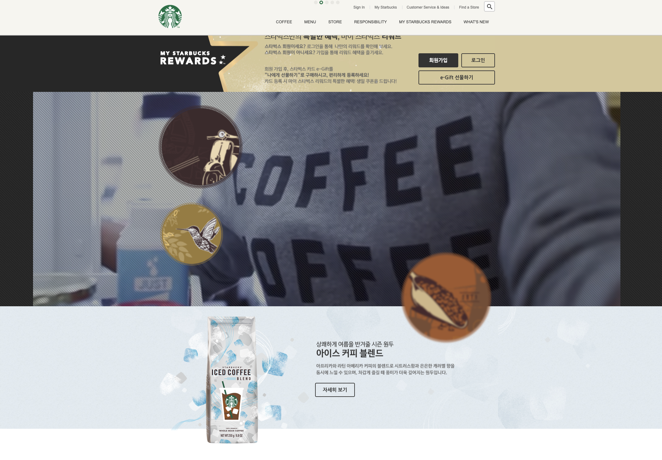
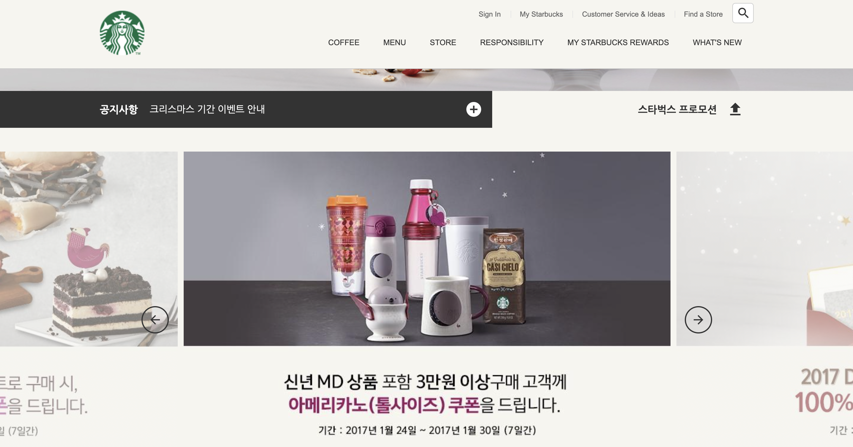
new Swiper('.promotion .swiper-container', {
  // direction: 'horizontal', // 수평 슬라이드
  autoplay: { // 자동 재생 여부
    delay: 5000 // 5초마다 슬라이드 바뀜
  },
  loop: true, // 반복 재생 여부
  slidesPerView: 3, // 한 번에 보여줄 슬라이드 개수
  spaceBetween: 10, // 슬라이드 사이 여백
  centeredSlides: true, // 1번 슬라이드가 가운데 보이기
  pagination: { // 페이지 번호 사용 여부
    el: '.promotion .swiper-pagination', // 페이지 번호 요소 선택자
    clickable: true // 사용자의 페이지 번호 요소 제어 가능 여부
  },
  navigation: { // 슬라이드 이전/다음 버튼 사용 여부
    prevEl: '.promotion .swiper-prev', // 이전 버튼 선택자
    nextEl: '.promotion .swiper-next' // 다음 버튼 선택자
  }
})


2. pagination 스타일 추가

📍 swiper 라이브러리에서 기본으로 스타일을 제공하기 때문에 개발도구를 열어 적용된 스타일을 확인한다.

📍 기본으로 제공하는 클래스명 : swiper-pagination-bullet / swiper-pagination-bullet-active

📍 기본으로 제공된 배경색을 없애고, 이미지를 넣어 스타일 완성

.notice .promotion .swiper-pagination { /*position값도 라이브러리에서 기본 제공*/
  bottom: 40px;
  left: 0;
  right: 0;
  z-index: 0;
}
.notice .promotion .swiper-pagination .swiper-pagination-bullet {
  background-color: transparent; /* 기본 배경색 제거 */
  background-image: url("../images/promotion_slide_pager.png");
  width: 13px;
  height: 12px;
  margin-right: 6px;
  outline: none;
}
.notice .promotion .swiper-pagination .swiper-pagination-bullet:last-child {
  margin-right: 0;
}
.notice .promotion .swiper-pagination .swiper-pagination-bullet-active {
  background-image: url("../images/promotion_slide_pager_on.png");
}


3. navigation(화살표) 스타일 추가

📍 공통으로 적용가능한 스타일은 묶어준다.

📍 각각의 위치는 %를 사용한다.

.notice .promotion .swiper-prev,
.notice .promotion .swiper-next {
  width: 42px;
  height: 42px;
  outline: none;
  border: 2px solid #333;
  border-radius: 50%;
  position: absolute;
  /* Swiper Container 높이의 절반만큼 끌어올림 */
  /* 버튼 높이의 절반만큼 추가로 끌어올림 */
  top: 300px;
  z-index: 1;
  cursor: pointer;
  display: flex;
  justify-content: center;
  align-items: center;
  transition: .4s;
}
.notice .promotion .swiper-prev {
  left: 50%;
  margin-left: -480px;
}
.notice .promotion .swiper-next {
  right: 50%;
  margin-right: -480px;
}
.notice .promotion .swiper-prev:hover,
.notice .promotion .swiper-next:hover {
  background-color: #333;
  color: #fff;
}


4. Toggle버튼을 누르면 사라지고 나타나기 🚨

(JS 힌트)

더보기

1) 상수 '버튼', '슬라이드' 각각 생성

2) 변수 '숨겨진 상태' 생성

3) !를 이용한 조건문에 '숨김' class 추가

(CSS 힌트)

더보기

1) '숨김'클래스에 높이 0

2) '프로모션'에 transition, overflow

// PROMOTION TOGGLE
const promotionEl = document.querySelector('.promotion');
const promotionToggleBtn = document.querySelector('.toggle-promotion');
let isHidePromotion = false; // 프로모션이 보이니? = 아니

promotionToggleBtn.addEventListener('click', function (){
  isHidePromotion = !isHidePromotion // 반대의 상태를 나타내는 느낌표, fasle와 true
  if (isHidePromotion) {
    // 숨김처리 : 프로모션이 숨겨졌니? 아니fasle -> 숨겨줘true 
    promotionEl.classList.add('hide');
  } else {
    // 보임처리 
    promotionEl.classList.remove('hide');
  }
});
.notice .promotion {
  height: 693px;
  background-color: #f6f5ef;
  position: relative;
  transition: height .4s;
  overflow: hidden; /* hide클래스가 추가됐을 때 내용이 넘치므로 숨김 */
}

.notice .promotion.hide {
  height: 0;
}
728x90
+ Recent posts
728x90